(03)Case studyLiveaboard booking site

Bucceo Diving

A booking site for a liveaboard dive boat, where divers compare trips, read each day of the itinerary and pick a cabin. I built the front end, responsive from phone to desktop.

My role
Front-end developer
Built with
React, Tailwind CSS, Framer Motion
How it works Live link soon
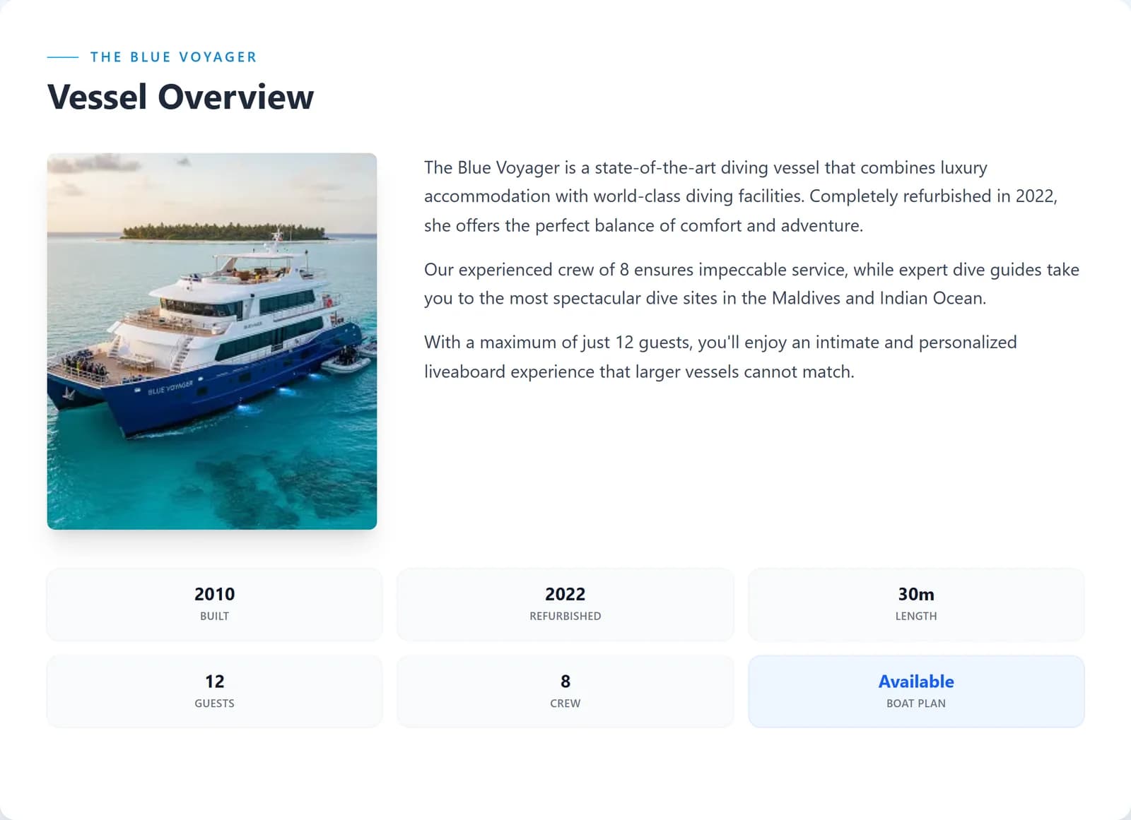
Vessel overview: built, refurbished, length, guests and crew
The Bucceo boat page: the Blue Voyager, rated 4.9
Choosing a cabin on a phone
(01)In short

01

What the client wanted

A booking site for a liveaboard dive boat that sells the trip: where it goes, what each day looks like, which cabin to pick and what the water's like.

02

What I built

The front end: the boat's page, the list of departures, an itinerary page for every trip and the cabin pop-ups, responsive first.

03

The result

One polished site that walks a diver from the first look to choosing a cabin, as easy on a phone as on a laptop.

sections on the boat's page
13sections on the boat's page
departures to compare
7departures to compare
tabs on every itinerary
5tabs on every itinerary
cabin types, each with details
3cabin types, each with details

Counted on the live site, October 2026

(02)What I built5 highlights

Built to sell the trip.

Each highlight says what it does for the divers booking, and how it works underneath.

01

Every departure, side by side.

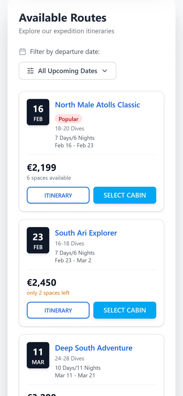
One table lists every trip: the date, the route, how many dives, how long, the price and how many places are left. A date filter narrows it down, and on the phone each trip becomes its own card.

For divers

Compare dates and prices at a glance, and see what's nearly full.

Under the hood

One list of trips drives both the desktop table and the phone cards, so they never disagree.
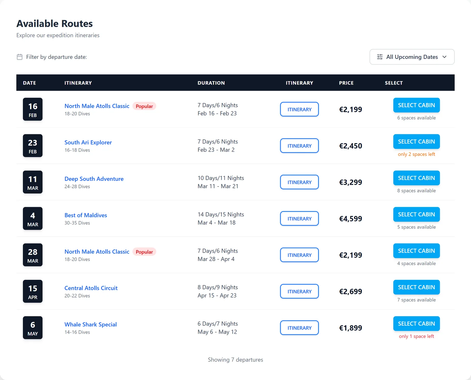
Available routes with dates, dives, prices and places left
The routes as cards on a phone

02

Day by day, before you book.

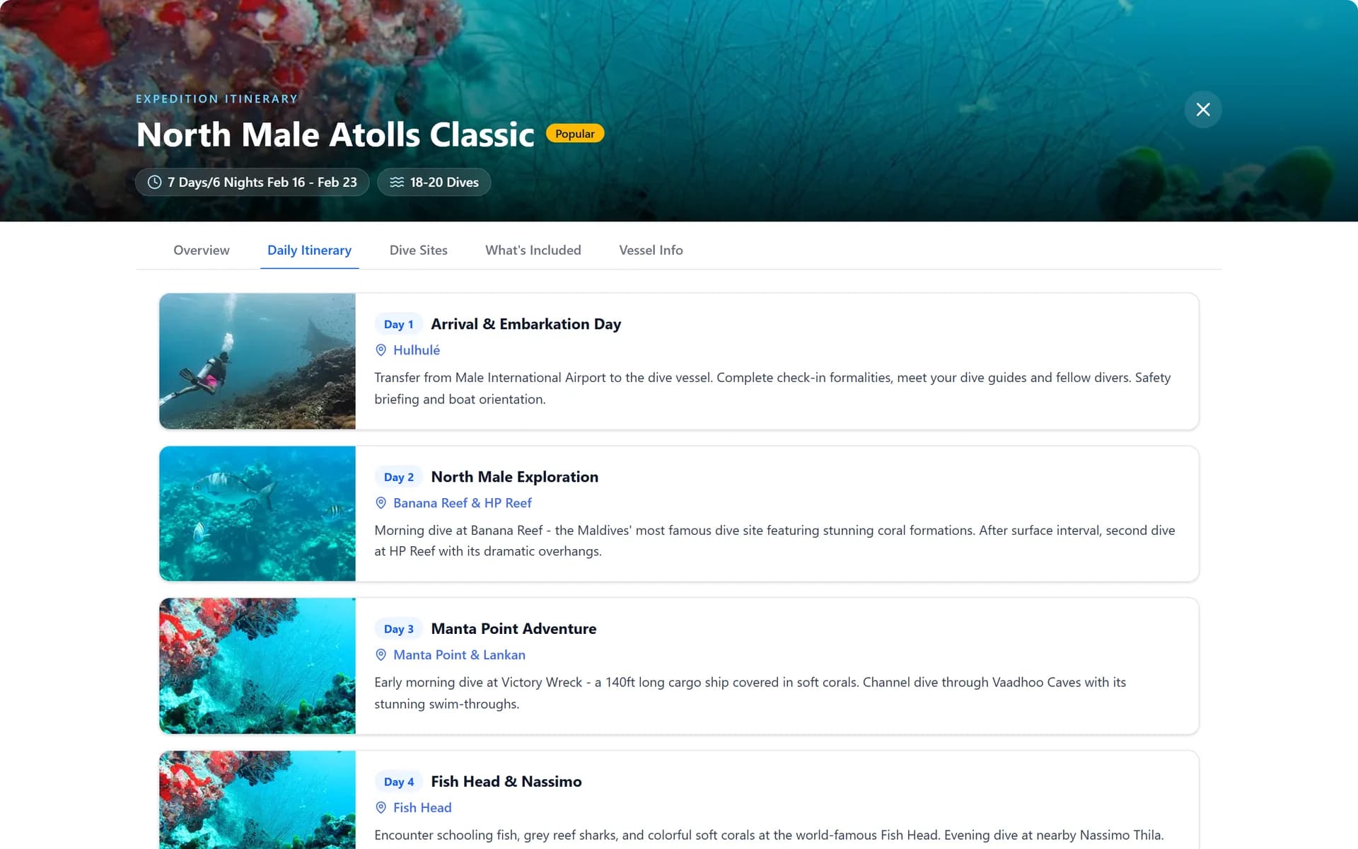
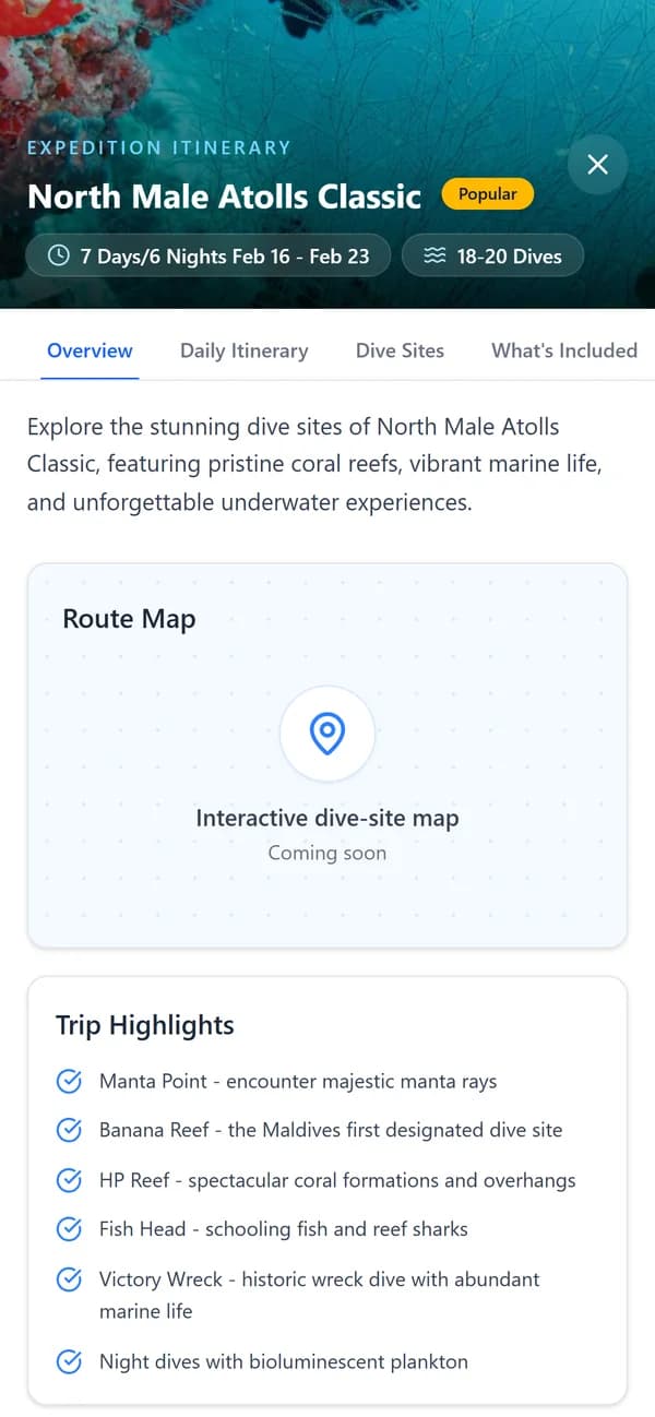
Every trip opens its own itinerary: an overview, the plan for each day, the dive sites, what's included and the boat, with the price and Select Cabin always at hand.

For divers

Know where you'll dive each day before you pay.

Under the hood

One itinerary page for every trip, built from the trip's details in its link, with five tabs.

The daily itinerary for North Male Atolls Classic
An itinerary on a phone

03

Pick your cabin, see it first.

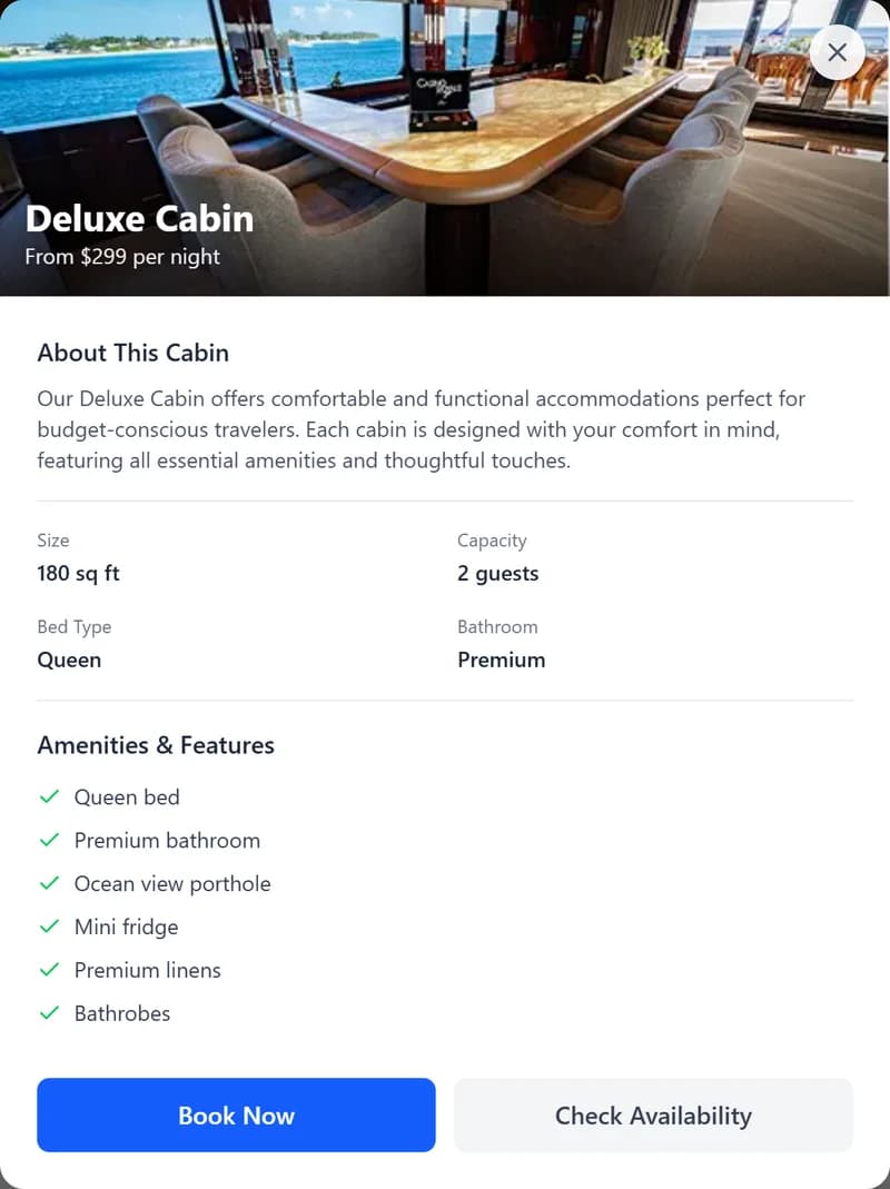
Three cabins, each with a photo, size, beds and price per night. View Details opens the cabin in a pop-up with everything it includes, without leaving the page.

For divers

See the room before you choose it.

Under the hood

The cabin pop-up animates in with Framer Motion and closes back to the same spot on the page.

Three cabins with sizes, beds and prices
The Deluxe Cabin details pop-up

04

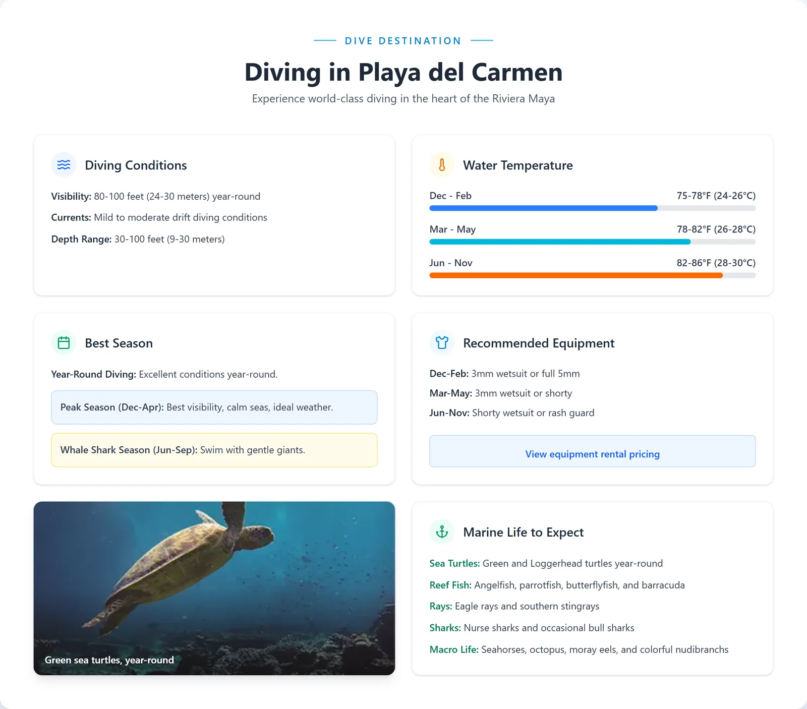
What the water's really like.

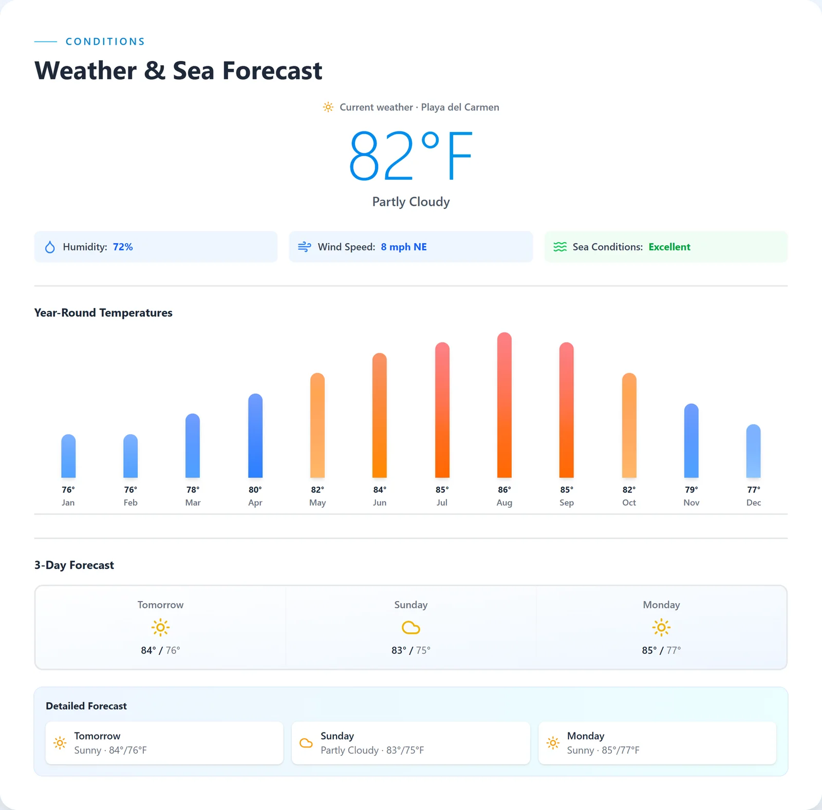
Visibility, currents, water temperature by season, the best time to go, what wetsuit to bring and what marine life to expect, plus the weather and a year-round temperature chart.

For divers

Every question a diver asks before booking, answered on the page.

Under the hood

Reusable panels and bar charts built with Tailwind, so the page stays consistent from section to section.

Diving conditions, temperatures, best season and marine life
Weather, sea forecast and year-round temperatures

05

Trust, before the deposit.

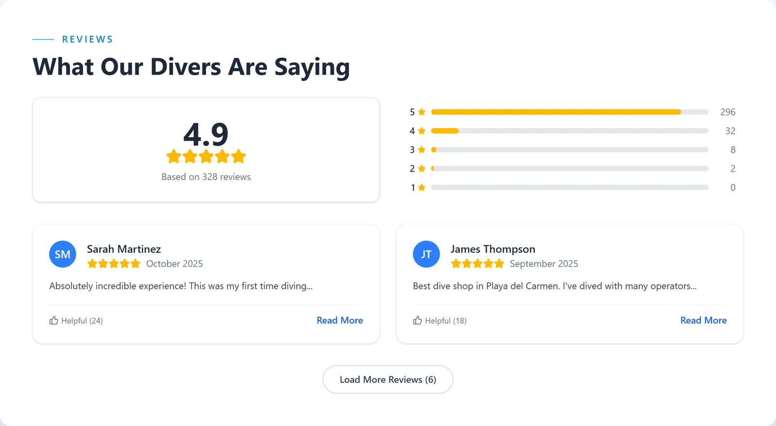
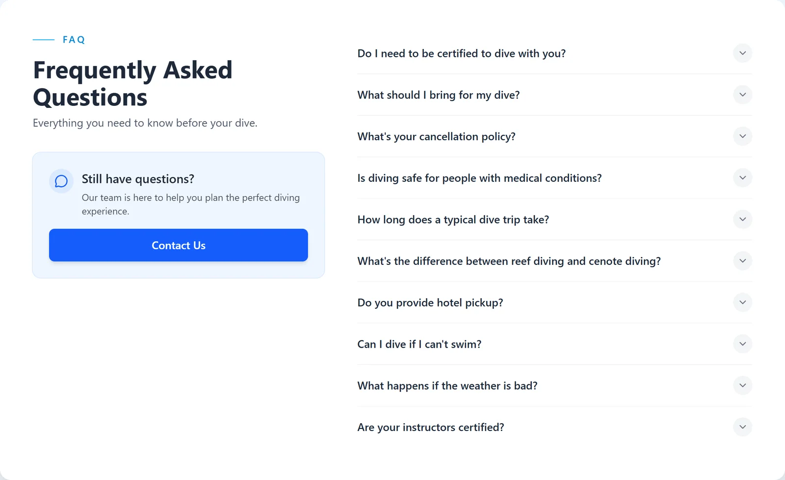
A rating breakdown with divers' reviews, and a FAQ that answers the usual worries: certification, what to bring, cancellations, safety.

For divers

Real reviews and straight answers, right where people decide.

Under the hood

An accordion FAQ and a review summary that show only what's needed until opened.

Reviews with a 4.9 rating breakdown
Frequently asked questions

Screens captured from the live site in October 2026. Trips, prices, reviews and boat details are the client's sample content.

(03)How it works

One page, every question answered.

My job was the front end: everything a diver sees and taps. I built it in React, responsive first, so it works as well on a phone on the dive deck as on a laptop at home.

Every part of the page is its own component (routes, cabins, conditions, reviews), styled with Tailwind, with Framer Motion for the pop-ups and transitions. That keeps the page consistent and easy to extend.

  1. Step 1

    A diver lands on the boat's page

    One long page of reusable React sections

  2. Step 2

    They compare the departures

    One trip list: a table on desktop, cards on a phone

  3. Step 3

    They read a trip day by day

    Its own itinerary page, with five tabs

  4. Step 4

    They pick a cabin

    Cabin pop-ups with Framer Motion, then on to booking

Built withReactTailwind CSSFramer MotionTanStackResponsive design
(04)The result

A dive trip you can book from your phone.

Divers can compare departures, read each trip day by day, choose a cabin and check the conditions, all on one responsive site that keeps the next step in reach.

Open to work

Have a project like this in mind?

I build complete web and mobile apps, for full-time roles or freelance work, remote in any time zone. A quick call is the fastest way to start.

I reply within a day, usually less.